Friday, November 15, 2013

POST # 15 LOEHMANN’S DRESSING ROOM: women and their bodies


I don’t know a single woman who has never been to Loehmann’s. It’s a tribal rite of passage from adolescence to womanhood; the day you went with your mother to try on real grown-up clothes was a landmark event in every young girl’s life.
(note: for the benefit of my male readers, Loehmann’s is a chain of discount clothing stores dating back to the 1940s, distinguished by large communal dressing rooms with mirrored walls and benches; no men allowed.)


In its early days (when I went on a regular basis) you could not return anything and therefore you needed to bring someone with you to prevent impulse buys that you would later regret. In a heedless (and unaccompanied) moment I purchased a slinky black crepe dress, a designer sample with what were then called “floating panels” on the back. I thought I looked divine, but since I was 5’6” tall and weighed 108 pounds, the effect was more Olive Oyl than Marilyn Monroe. Anyhow, I had an important date and wanted to be as devastating as possible. When I walked out of my bedroom in my new purchase, my father took one look at me, cleared his throat and said, “Remember, Renee; you’re the intellectual type.” (not quite what I wanted to hear). When my date arrived, a few minutes later, he burst into uncontrollable laughter. That did it. I went back into my room and changed into something more appropriate for an underweight intellectual. Since Loehmann’s had a “no return’ policy at the time, my error in judgment (or self image) hung in my closet, haunting me for many years.

I had better luck on another occasion when I actually brought a suitor to the Loehmann’s store on Fordham Road in the Bronx. At that time, it had a balcony where men could wait until “show time” when their lady friend emerged for a thumbs up or thumbs down sign. The store had acquired some samples of form-fitting chiffon dresses made up of tiny pleats, Fortuny style. They clung to your body like a wet Grecian toga. Unlike my previous debacle, (maybe I had gained a few pounds) the sight of me didn’t elicit a laugh but an instant proposal of marriage. It was very flattering, but since I couldn’t walk around in a sheer toga the rest of my life, I didn’t see much future in the relationship.

My last visit to Loehmann’s was a few years ago. Fortunately for me, evil satirist that I am, they were having a half price sale on bustiers that day. For the benefit of my male readers, a bustier is like a fancy corset that laces up the front or the back, pushing your breasts up to your collarbone, while exposing your ass. The sight of all those women, all sizes, shapes, ages and colors in that vast mirrored dressing room, trying to get a look at their rumps, has stayed with me lo these many years and given me an endless supply of artistic inspiration.


Friday, November 8, 2013

POST #14: TO CROP OR NOT TO CROP

152 Delancy Street  c1955
(Kodak Brownie Camera snapshot)
Anybody can be a decent photographer today. Buy a hi-res digital camera, read the manual, find an attractive subject, improve it on Photoshop it, mat it, and voila! you’ve got a decent photograph! But, how do you transcend mere competence and create a work of art? For that you need a soul and that can’t be bought in the camera store.

Let’s start by discussing “cropping”, always controversial. Photographers love to argue about cropping. Is it acceptable or not? moral or immoral? Is it true that the “great” photographers, i.e. Cartier Bresson, never cropped but could create masterpieces in the viewfinder?  My feeling is, what difference does it make whether one composes in the camera, or in the darkroom or on a computer screen? I say whatever looks good, is good. There are no “nevers” in art; we learned that long ago.

I am occasionally asked to judge one of the many camera club competitions in the area. I carefully forewarn them that I am not a photographer, that I don’t know an F Stop from a G String. But what I do know is how to compose an image, how to transform something mundane into a work of art. I am usually one of three judges, the other two, professional photographers. Yet it always ends up that I, surprisingly, am called on the most often. Why?

Cropped version 152 Delancy Street
When the image to be critiqued goes up on the screen, the other judges invariably comment about focus or technique: i.e. there’s a speck of dust on the image, aaagh! I, not knowing or caring about technique, concentrate on two things: originality of image and the quality of the design. Unfortunately, you can’t teach originality; it requires an authentic “self” and there aren’t too many authentic selves running around today. But, composition can be taught or at least demonstrated.  I do that mainly by showing the group how to crop. I hold my hands up at the projected photo on the screen, squint at the image and take a little off the top, something off the bottom, and before their eyes, the photograph is transformed. The audience gasps. Instead of an uninteresting cliche, they are now looking at something approaching real quality.


Detail, 152 Delancy Street
Many years ago I came across an envelope of undistinguished Brownie snapshots I had taken of the Lower East Side when I was just out of art school. They were supposed to be reference material, images of buildings and stores I wanted to use as background in some paintings I was doing. I had the 2”x2” negatives developed and the results were truly awful. But then I blew them up and began to crop them, transforming the mundane into something magical. Some I thought (egotistically) were even better than similar work being done by Berenice Abbott at the time. Not technically of course (she used a giant still camera on a tripod), but as works of art. I may be a piss-poor photographer (I haven’t gotten much better over the years) but I’m a great cropper….and apparently, that’s what makes the difference.

Friday, November 1, 2013

POST #13: ARE THESE WOMEN OFFENSIVE?

I was recently asked to participate in an Art Walk by putting my work in a storefront window on a well-trafficked downtown street. Normally, given the kind of art I do (no pretty pictures, lots of raunch), I avoid events like this like the plague. It’s one thing for someone to come to a gallery to see my work – they get what they deserve; it’s another to have it shoved in their face. I always believed that public art needed to consider the public. If it meant tamer work, so be it. Artists can create whatever they want in their studios, but passer-bys shouldn’t be forced to look at it. 

Anyhow, someone from the local business council  recently contacted me about putting my work in the window of the Bridal Shop on Bedford Street, a primo spot with lots of foot traffic.   Given my sentiments about controversial public art, I was hesitant as to whether my satirical work was appropriate. The owner of the store and the representative from the council in charge of the walk came to my studio and enthusiastically selected a group of life-size paper dolls that poked (gentle) fun at racial, ethnic and other stereotypes. We decided that the dolls (all seven of them) would look great in the store’s window. One of my characters, a pregnant, “possibly” Hispanic teen-ager could wear a wedding veil from the shop’s collection. She would stand in front and the others, all in fancy underwear, would form the wedding party. When we installed the figures, the response from passer-bys was heart warming. Everyone saw the humor and loved the work. Crowds gathered, laughing and praising the installation.
And then the trouble began. The director of the sponsor, the downtown business council, said my work would cause a problem (racial stereotyping). My pregnant teen-ager with her wedding veil would have to go. “But, that’s the whole point.” I protested. “I’m making fun of stereotyping!” She replied that she didn’t want to deal with all the angry phone calls. I told her to tell them to call me and I would deal with them. We ended up compromising (that’s what Public Art is about) and my curly-haired “Latina” could stay in the window, but without the veil and not up front.

To the best of my knowledge, nobody protested, although literally hundreds of people attended the Art Walk. I was told that everyone loved the dolls…thought they were hilarious, even the “stereotypes” themselves liked them.  I heard of only one complaint. Someone walked by at the end and threw a paper cupful of coffee at the window, protesting that I was making fun of “fat people.”  True, but I was also making fun of skinny people, old people, various ethnic types, etc. I’m an “equal opportunity” satirist. That’s what art is supposed to do, elicit a reaction, even if it’s only a cup of coffee tossed at a piece of glass!


So, all in all, I consider the event a success. I probably won’t be invited back next year, (too controversial) but, what the hell! This year was fun.

Thursday, October 24, 2013

POST #12: Keeping Secrets

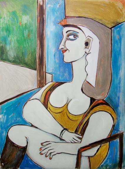
Renee Kahn Channels Picasso's Cubist Period,
oil on canvas 40"x32"
I have a vivid memory of a trip to a glass and mirror store in New York City when I was a teenager. The owner, ancient by my standards, had been a glazier for over fifty years. He told me that when he first entered the business, “silvering” glass to create a mirror was a well-kept secret. Silverers worked behind a curtain so that no one could steal their formulae. Now, of course, silvering comes (like everything else) in a spray can.

This is sort of a roundabout way of getting to my subject, how some artists freely share their techniques, while others hide “behind curtains,” refusing to give away the tricks of their trade. The truth is, no one, unless he is a professional forger, can imitate another artist; I can’t even copy my own work. A work of art has a soul, and while you can use someone else’s materials and methods, the soul isn’t there and any reasonably expert student of art can spot the difference. Just because you know how to etch doesn’t mean you can be a Rembrandt. Since I started my professional life as an art teacher, I am prone to telling all I know. I have no technical secrets to hide, and, in fact, I don’t even think they’re worth imitating. But other artists feel differently; I’ve met some who are extremely open about sharing, giving you a blow by blow description of their working methods, while others guard their secrets possessively, even to the point of giving out false information.

Renee Kahn Channels DeChirico.
Cardboard box collage 22"x14"x3"
A number of years ago, I attended a lecture series in which several well -known artists showed slides of their work and answered questions about “process” to an audience that included a goodly number or working artists.  One of the presenters was Richard Haas, a noted photorealist who did trompe l’oeil murals on huge urban walls. His “shtick” was to create architectural detail to replace what was demolished. What an irony; painted architecture instead of the real thing. In 1976, for the City’s bi-centennial celebration, I created a pair of photorealist murals using slides of old Stamford projected onto two downtown walls. These murals were painted at night by volunteers standing on rickety, “you’re taking your life in your hands” scaffolding. I was curious to know how Haas created his infinitely more worthy masterpieces and so I asked him. I was taken aback when he fum-fuhed and gave vague, deliberately un-useful or misleading answers. “Ahem, well, …sometimes I project and sometimes I grid it up” (the historic way of enlarging work.) Duh! Did he really think that anyone could do his exquisitely detailed 60’high paintings based on information like that?

The next speaker at the art symposium, Jane Freilicher, was totally the opposite. An abstract expressionist landscape painter (an oxymoron, I know), who lived and worked among the Pollock/De Kooning crowd on the eastern end of Long Island, she freely shared the tricks of her trade. When asked, she told the audience that she used Windsor Newton’s medium, Liquin, a mix of varnish and linseed oil, to make her paint luminous and flowing. She couldn’t have been more eager to give out her work methods. Trust me, even knowing how she did it, I was never going to paint landscapes like hers, however, I now use Liquin all the time. It’s great stuff.

"Picasso's Mona Lisa" by Renee Kahn.
by way of a contemporary Minoan Goddess
 (note MP3 player).
Oil on canvas,  42"x34"
Art history is full of stories of artists stealing from other artists. While one artist can pick up ideas from another, the great artists are just not copy-able,  Most artists rarely talk about technique; their secrets go to the grave with them. I remember reading a 500 page biography of Mark Rothko, one of my favorite 20th century painters. In all that verbiage, there wasn’t a single line about his work methods. Did he tone the canvas first? Use oil or acrylic or a mix of both? Stretch the canvas before or after painting on it? I was dying to know. The author listed the name of practically everyone he ever slept with, but not a hint as to how he worked.

Several years before he died, Picasso allowed a movie to be made of him working on transparent panels that could be photographed from behind. Although I now know a lot more about how he created the masterpieces of his later years, I’m never going to be another Picasso, He knew he had nothing to fear.

Friday, October 18, 2013

BLOG POST #11: IMMERSIVE/IMMERSION ART


I was all set to propose a new art movement I decided to call “Immersion Art,” the creation of an environment in which the viewer could “immerse” himself, when I realized that it wasn’t new at all, in fact, you could say that’s it’s as old as humanity itself; it’s what the cave painters were doing when they performed multi-media rituals in torch- lit caves with hordes of painted pre-historic animals as a backdrop.

My form of Immersion Art is singularly low tech. I don’t use lighting or slides or computerized images, just an old-fashioned overhead projector, the obsolete kind we used to use in schools to put lessons on a blackboard. Many years ago, when I was teaching art history at the University of Connecticut, I remember walking by a classroom and seeing chemistry notes put up for students to copy. I remember thinking, why did it have to be boring formulae; why couldn’t it be art? I started photocopying my sketches onto transparent sheets of plastic and using these enlargements as the basis for paintings. In recent years however, I decided to carry it a step further and make the projected images themselves into an art form, and lately, going even further, I began to include the viewer in the image as well.

What exactly is “Immersion Art?” My son, Ned, an environmental sculptor (and don’t ask me what that is) explains it beautifully. He claims “it’s the difference between being inside a forest versus standing next to a plant. “ Anyhow, I soon discovered I could use the overhead projector to create the forest.

I recently sent out an e-mail to a group of local artists, asking for unwanted overhead projectors (they were obsolete; everyone was now using PowerPoint and a computer) and ended up with eighteen perfectly good machines that were taking up storage space in local schools. I could have acquired dozens more if only I had a bigger attic! A lifetime supply I hoped!

Many years ago, just out of art school, I went down to the Lower East Side and took a roll of snapshots with my new Kodak Brownie camera to use as reference material for some paintings of street life I was doing. However, I never got around to using the images and the envelope with the prints and negatives remained untouched for years. About a dozen years ago, I found the envelope, unopened, had the images printed and began to use them as backgrounds for a series of cardboard box dioramas I was working on. Recently, I copied the scenes onto sheets of acetate to use with the overhead projector. In my darkened studio, I was able to re-create a lost world one could actually enter, his or her shadows mingling with the people I had photographed on Delancey Street or under the Third Avenue El decades ago. I then borrowed a half- dozen projectors and put together an exhibit that filled a huge, windowless art gallery. By projecting and overlapping the images twenty feet high, I created a world people could actually walk into, blurry, dream-like and surreal. 

The closest thing to this experience nowadays is what happens when you go to a natural history museum or zoo where they recreate a rain forest, replete with steamy temperatures and exotic birdcalls. If I ever get a chance to do this installation again, I will try to tape street sounds and music, making it even more “Immersive.” Smells of food and garbage would provide a nice touch as well. The overhead projector, low-tech as it is, can pull you into an environment that evokes memories of the past.

I like to think I invented “Immersion Art,” but the truth is, it has been around (under other names) for millenia, “multi-media” rituals that combined art and theater. The Medieval cathedral, another multi-media experience also “immerses” the viewer as does going to the theater. More recently, the “Happening” movement of the 1960s involved the audience in a multi-dimensional manner that evades the standard “art-on-a wall-to-be-sold gallery experience. Best of all, having no product to market frees both the creator and the viewer, allowing them to inter-act rather than trans-act. “Immersive/Immersion Art” is still going strong


Wednesday, October 9, 2013

BLOG POST #10: THE ART OF ACHIEVING BALANCE


Having taught art history at the University of Connecticut for over twenty years, I spent a great deal of time explaining “great art.” But what constitutes great art? What makes one painting “great” and another just “good”? I would often show my students two slides of paintings, side by side, and ask which one was better. Both works had been expertly painted by well-known artists, the subjects and compositions were almost identical. However, the class – artistically illiterate as they were - was always almost unanimous in preferring one over the other. There were obviously forces at work here, even if no one could articulate them.

What makes a painting a masterpiece often boils down to its underlying abstract design, not the drawing or the subject matter. Art students are invariably taught something called “ The Principles of Design,” Balance, Unity, Focal Point and Rhythm among them. One favorite art school project is to take a famous painting, let’s say Brueghel’s “Wedding Dance” and break it down to its basic design elements.  When I taught art history I would often project a slide of the painting onto the blackboard and proceed to outline its major shapes in chalk, describing how they worked together using the Principles of Design. When I turned the lights on, the abstract basis of a non-abstract painting would be clearly revealed. The class would sit there mesmerized.

Let’s start by talking about “Balance,” since that is a relatively easy Principle to explain. Think of a seesaw with a child at either end. The seesaw must be “balanced” if it is to work. This usually requires the children to be of equal weight but you can also achieve balance with two light and one heavy child, or by placing one child closer or further towards the middle than the other. Paintings operate the same way, although in a much subtler fashion. If successful, the work simply “feels” balanced, even if you can’t say why. For example, if you took something away or added something on one side of the painting, you might have to do something on the other in order to maintain that sense of balance.  And in the end, it’s the old “You’ll know it when you see it.” It’s purely intuitive; it can’t be plotted or explained mathematically, but it’s there.

I decided to illustrate this post with some small, scrap metal collages I put together a while ago based on the work of the German “Dada-ist” artist, Kurt Schwitters. Around 1920, Schwitters began to experiment with the aesthetic value of “junk:” scraps of paper, wood, metal, whatever  cast-offs he could find. I personally collect most of my detritus at Vulcan Scrap Metal located on Sunnyside Avenue in Stamford, a place that buys and sells scrap metal by the pound. Lots of sculptors go there, including my son from California who makes sure to visit whenever he is on the east coast. To me, Vulcan is a treasure trove of all kinds of scrap metal, often rusted and covered with dirt, but interesting nonetheless. I compose and collage the pieces together, Schwitters style, and glue them on to 5”x7” pieces of black Velcro. The finishing touch, a gaudy black and gold Baroque frame, provides the contrast of garbage framed in gold. The pieces themselves, their origins, are irrelevant; it’s the composition that counts, primarily the way everything “balances.” Lately, I have been picking up crushed cans from the side of the road. Properly “weathered,” they take on a visual life of their own; I call them “Road Kill.”


Friday, October 4, 2013

POST #9 :BOSOMS: A Tribute to….


Seven Deadly Sins: Envy  48"x34"
A recent visitor to my studio commented that there appeared to be an awful lot of bosoms in my paintings. I thought about it for a while and decided he was right. I’m not particularly sex obsessed or even overly concerned with body parts, so why so much pulchritude in my work? Maybe it’s because I’m a social satirist and if you live in a society like ours, isn’t bigger always better?

I can’t tell you how many times I have observed a hefty female on the street proudly packed into a stretch outfit at least four sizes too small. They walk (jiggle) with enormous pride, seeming to say: “I sure am something! ” This is especially obvious during summer months when more gets exposed. The period in art history when pendulous body parts were most in vogue was the prehistoric era when female fertility statuettes were composed entirely of exaggerated sexual organs. Just breasts and pudenda. 

The current fashion in the female body appears to be surgically enhanced breasts tacked on to anorexic bodies. Nature doesn’t work that way; slim women are usually slim all over, but in an effort to be more attractive or fashionable they distort the natural beauty of their real bodies. I recently watched someone at the local health club proudly display her newly acquired, perfectly round breasts (think cut-in-half –cantaloupes attached to a chest wall), crowned by her tiny, original nipples. Did the man in her life really think this was an improvement? Shame on him!

Seven Deadly Sins: Pride  68"x44"
The role of a satirist is to point out the foibles of society. There’s a difference between being lewd and making fun of lewdness. If you think my stuff is raunchy, take a look at George Grosz’s drawings of women on the street in 1920s Weimar Germany. Lecherous bastard that he was, Grosz showed them fully dressed but also fully naked under their clothes, the way he assumed men imagine them, In no way do they resemble the serene, nude goddesses of Classical periods. There’s a big difference between nudity and nakedness.

My women are fertility symbols, goddesses of plenty and proud of it. They wouldn’t dream of being surgically altered; they don’t diet, wear padded, push-up bras or elasticized underwear. They let it all hang out!